Friday, June 28, 2013

A Bright & Cheerful ATC


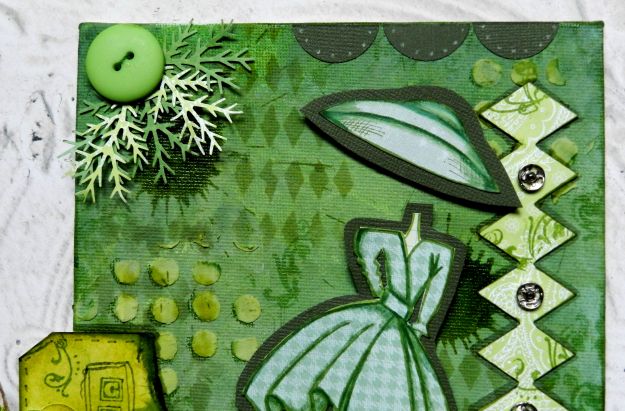
We have a brand new challenge today on the ATCs With Attitude challenge blog. The theme is Bright and Cheerful which really is an easy one for me since that is my go-to style. I was fortunate to work with this lovely Flower Basket image from Eureka Stamps. I always enjoy colouring flowers...and there are no weeds to pull. Bonus! I coloured the image with Prismacolor pencils, fussy cut it, matted it in black for definition, and fussy cut it a second time.


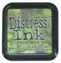
The background was done with Neocolor II crayons over watercolour paper. Once dry, it was stamped with an Inkadinkado script stamp and Coffee Archival ink. Scraps of pink striped, purple dotted, and watercolour paper were layered in a band across the center and at the bottom of the atc. Picked Raspberry Distress ink was used to edge the card and white faux stitching was done over the purple border. The entire atc was matted with brown cardstock. When I am going to do this, I cut the top layer a little smaller than the standard 2.5" x 3.5" size so that when the mat is added, it brings it to the correct size.

The basket image was popped up on foam dots and adhered to the background. A small black dragonfly brad, a pink flower button threaded with brown floss, and a hand cut photo corner were added as the final embellishments.

Thanks for popping by for my second post of the day. If you get a minute, pop by the ATCs With Attitude blog and see the Bright & Cheerful inspiration atcs created by the rest of the DT. be sure to welcome our two new DT members, Vicky and Margaret. We're so happy to have them on board.

Life is good; so is art.
Bonnie

Sneak peek from eclectic Paperie


Hello everyone! Today is my turn to post on the eclectic Paperie blog. I decided to feature a few more of my altered playing cards from the Mary Jane Chadbourne class. I have a whole stack of them with the backgrounds coloured and the paper scraps on. I've even auditioned the images and have the quotes/sentiments chosen but this week other things have called shotgun and are playing navigator...hey, that would make a great journal theme :)

Anyway, if you aren't sick of these yet and feel so inclined, follow this link to arrive at the eP blog and have a look-see. I'd love it if you did. Thanks for stopping by. I hope you have an awesome weekend.

Life is good; so is art.
Bonnie

Wednesday, June 26, 2013

The bloglovin' plunge

Well, I took the bloglovin' plunge by transferring my personal list from Google Reader to bloglovin' because I don't want to miss a single post from my favourite bloggers. I also added the bloglovin' button to my sidebar so that if anyone still wants to follow me they can. (Please, please, please!!) It actually was a piece of cake to do both. Now I wonder why I procrastinated. Isn't that always the way :D

I had a bit of a play and created a few more altered playing cards from The Spoken Soul online class taught by Mary Jane Chadbourne at Artful Gathering. The backgrounds are done with gesso, Neocolor IIs, Inktense blocks, Gelatos, Distress inks and stains, acrylic paints and inks, and layers of paper scraps. Since the backgrounds were done at different times from the paper layers and the images etc. I couldn't tell you what I used on each card. I do all the backgrounds, then all of the paper scrap layering, then stencilling and stamping, and then I audition the images that I have fussy cut and keep in a container. Once those have possible card homes, I audition quotes that I have produced on my computer. What I can do is point out any embellishments or features specific to each card.


For example, this first card has a scrap of embossed black cardstock drybrushed with metallic gold acrylic paint. The half round "sun" is a piece of grungepaper sprayed with Dylusions inks. The clock was fussy cut and coated with Glossy Accents to make it look like a watch crystal was on the face. Her little hand was cut between the thumb and palm so that it would look like she was really holding the clock.


The next card has black half pearls decorating the banner flags. Dew Drops became the fish bubbles and were shaded next to the left side to give them dimension and allow them to be more visible. The white ring around the K was done with watered down gesso and a small lid to a bottle. A slight twisting motion once it's down on the card gives a less uniform ring which I like.


The third card has a moon image layered over the circle of paper already adhered to the card. He was given a top hat and a punched butterfly bow tie with an additional black butterfly behind it to create a shadow. His monocle is a jewellery jump ring with a Dew Drop adhered inside to create the effect of the glass. The bonus is that the Dew Drop magnifies that eye...very cool IRL. The tiny photo corner was handcut, dotted with a paint pen, and given a white half pearl accent. The quote has gold ink along the black matting edges in order to repeat the gold in his monocle.

I'm still having a blast creating these and coming up with those little details I like so much. They help my mojo want to hang around which is a bonus. Anyway, thanks for visiting today. I'm hoping that you will continue to subscribe either through email or bloglovin. I'd love it if you did :) I talk to myself enough already. It's nice to know someone else is listening...lol.

Life is good; so is art.
Bonnie

Tuesday, June 25, 2013

Create Yourself ~ eTeam picks challenge


I'm late! I'm late! For a very important date! The eTeam picks challenge at eclectic Paperie started last Thursday and usually I post my response the same day but flower gardens, home renovations and life in general got in the way. The good news is that it continues until July 4 so I'm still within the challenge window. Our wonderfully talented Annette Green chose the theme of Monochromatic for June's eTeam challenge and right away I knew I was in trouble. I don't believe I have ever created anything monochromatic in my life. I am a big fan of combining lots of bright colours along with touches of both black and white. This, my friends, was a huge challenge for me...darn near daunting :) That's why I chose a smaller canvas to alter (6" x 8"). I figured the less real estate I had to fill the better.


I first covered the background with Neocolor II crayons blended with water. I wasn't happy with the intensity nor the shades of green so I covered that with Inktense blocks and water to spread the ink. Still not satisfied. Next, I applied Fresco paint in Hyde Park, Avocado, and Snowflake using a piece of Cut N Dry foam and keeping the paint wet to help with blending. When the paint was dry, Peeled Paint Distress ink was applied through the Dylusions Diamond of a Border stencil as well as the Dotted Flowers stencil. Peeled Paint Distress stain was mixed with Studio 490 white embossing paste and applied through the Dotted Flowers stencil to create greater dimension. Once dry, the circles were shaded on the left side with a Prismacolor pencil. The Distress stain was also splatted onto the canvas in several places to make the inky circles with the radiating drips. Have you tried that? So fun!


Some lighter green patterned paper from my scrapbox was cut with the MFT harlequin border die and adhered to the canvas in two places, after the edges were inked with the Peeled Paint Distress marker. The same marker was used to outline the diamond border on the canvas. Sewing snaps were taken apart and glued onto the diamonds . A TH flourish stamp was inked with Memento Bamboo Leaves  and stamped over the top of the diamonds and around the edges of the canvas. A manila tag was torn, inked with Peeled Paint Distress ink and edged and stamped with Memento Bamboo Leaves. Before the tag was adhered to the canvas, dotty ribbon was threaded through the hole and tied with a burlap string.


One of the Dylusions Mini Couture women from the set was stamped onto three different papers: one for the hat, another for the dress, and a third for the body. The parts were fussy cut, the dress adhered to the body, and the elements matted with dark green cardstock. Shading was done with Prismacolor pencils. They were then placed on foam dots for dimension and adhered to the canvas. To complete the project, 1" circles were punched from the same dark cardstock, cut in half, and glued to the top edge. Green Prisma pencil created the dots on the circles. Pine needle branches were punched from green scraps using a McGill punch and adhered behind a threaded green button. Along the bottom, an Idea-ology word band  (Life is about creating yourself) was threaded with baker's twine and glued in place with Glossy Accents. Peeled Paint Distress marker deepened the outer edges of the canvas to create definitiion.

Phew! I made it! I really had to fight off the urge to add white and black accents, a brighter button, and maybe a coloured belt. I really do like my usual variety of colours but thoroughly enjoyed the challenge that the Monochromatic theme presented. Thanks, Annette, for the push  that got me out of my comfort zone :) Thanks also to all of you for joining me on this adventure. I'm glad to know you were right there with me. Pop over to the eclectic Paperie blog, if you get a chance, to see Annette's take on her challenge as well as the wonderful inspiration pieces by the rest of the DT. I'd love to come for a visit...maybe you'll play along with us.

Life is good; so is art.
Bonnie

Below are the links to some of the products used above which can be found in the eclectic Paperie store:


:


Monday, June 24, 2013

In the Garden ~ Craft Your Passion challenge 168


Well, Happy Summer, now that it is officially here. One of the things I love most about the summer is watching my flower gardens change and grow. The bright colours, copious butterflies and bees make me happy and provide lots of entertainment. That's why the challenge this week at Craft Your Passion is right up my alley. The theme is In the Garden and we want to see garden themed images or scenes. I was able to play with this sweet little gardener (Pure Innocence 017) by Heather Ellis. I just love her little boots and watering can. I coloured her with Prismacolor pencils, cut her out using an oval template, and inked the background with Tumbled Glass and Broken China Distress inks. She was then matted with brown cardstock.


The background paper comes from October Afternoon's Fly a Kite collection and was matted in brown cardstock. The floral paper and the dotted paper are from DCWV's Butterflies & Blossoms stack. A flower button was threaded with jute and adhered beside the image which had been popped up with foam dots. The metal thanks charm was adhered at the bottom of the image oval and corner pieces from the DCWV stack were also adhered to the background. Easy Peasy!

Thanks for stopping by today for a visit. I truly appreciate your time and sweet comments. They make my day. If you have a minute, pop over to the Craft Your Passion Challenges blog to see what the rest of the DT created in response to our In The Garden challenge. It's worth the click :)

I am entering this card in the following challenges:
2 Sisters challenge #149 ~ Summer Fun
My Creative Moments June Wordplay Saturday ~ Summertime
One Crazy Stamper  June Challenge ~ Summer Fun
Brown Sugar Challenge #47 ~ Summer
Creative Corner Challenges ~ Summer

Life is good; so is art.
Bonnie

Sunday, June 23, 2013

Be an original ~ Eclectic Ellapu Challenge


Anyone who knows me, knows that I am not much of a cook. My husband does all of the cooking in this family. However, I am able to follow a recipe...especially a challenge recipe :D That's what Andria wants us to do for this week's Purple challenge at Eclectic Ellapu. The recipe has the following ingredients: 1 stamped or digi image + 2 embellies + 3 papers + 2 diecuts. That I can do!!

I started with a 3.5 x 4.25"  block of wood left over from our recent reno project that is just shy of 1.5" thick. The sides were covered in Rusty Hinge Distress Stain and the top had a ledger type paper from MME's Reunion pad adhered with gel medium and then trimmed to fit the block. The TCW hexagon stencil was used with Rusty Hinge Distress ink to create a pattern over the paper. A second patterned paper from the same collection was die cut with a die from Spellbinders Office Supplies set to create the torn notebook edged rectangle. A third paper was die cut with an MFT large scallop die and adhered over the second paper. Once they were glued to the wood block, a small ink blot stamp from Hampton Arts was randomly applied to all papers.


The digital image is from Deidre Mosher as is the sentiment. Both were coloured with Prismacolor pencils and fussy cut. Olive's glasses and the O of original were coated with Glossy accents to create dimension and shine. Flat pearls were placed in the three corners of the frame, on the hat ornament, and on the center of a punched flower which was added to her hat decoration. The edges of the frame were inked with Vintage Photo Distress Ink and the image was matted on black cardstock before being popped up on foam tape.

To complete this project, the sentiment was matted with black cardstock and popped up on foam dots. Black cord, my second type of embellie, was criss-crossed below the image and tied in the back. Faux stitching was placed around the edges of the block which was then outlined with a black Big Brush pen to create definition.

Just a fun and quick little project which manages to follow the recipe...just don't tell my husband. He might expect me to do that in the kitchen and that would seriously cut into my play time. Thanks for stopping by today. If you get a chance, pop by the Eclectic Ellapu blog to see how the rest of the Purple Team spun this recipe. I hope you feel inspired to play along.

I am entering this project in the following challenges:
Allsorts Challenge ~ Weeh 212 Outside the box (wood remnant from house reno)
Seemacrafts ~ June Challenge Mixed Media
Stampin' for the weekend ~ Anything Goes
Stamping Dragon Challenge ~ Anything Goes

Life is good; so is art.
Bonnie


Friday, June 21, 2013

My latest obsession


Here are a few more of my altered playing cards from The Spoken Soul online class offered by Mary Jane Chadbourne at Artful Gathering. The backgrounds are layers of Neocolor II watercolour crayons, Inktense blocks, Distress inks and stains, Gelatos, Big Brush pens, acrylic inks and paints combined with stencilling and stamping. The papers are mainly from my scrap box ...Go me!


The images come from many sources including Deviant Scrap (Tumble Fish Studio) and Etsy stores like Cemerony. All of the quotes are computer generated and the bits and bobs are from my stash. These are a fabulous way to use things left over from other projects and sitting on my desk until inspiration and need collide. It's also a great place to try out new techniques or media.


Thanks for stopping by for another peek at my latest obsession. I have more coming soon to a post near you  so stay tuned :D

Life is good; so is art.
Bonnie


Thursday, June 20, 2013

Talk about Fabulous...


I am taking an awesome online class right now at Artful Gathering called The Spoken Soul. The instructor, Mary Jane Chadbourne, is awesome. She is a fabulous artist who shares her vast knowledge and enthusiasm so well. I appreciate her teaching style, her inspiration, and encouragement. There are some very talented people taking the class and sharing their works in progress.


We are altering decks of playing cards using mixed media products and techniques and then collaging images and quotes onto the cards to serve as reminders of messages we want to remember or that speak to us in some way. I'm not going to share the usual detail in order to respect Mary Jane's class content but I do want to share some of my almost finished cards. I still need to finish the backs and decide how I want to display these for them to be considered complete.


I am having a blast creating these mini works of art. They are lovely because each card does not have to be completed in one sitting. With the multiple layers and steps, I can spend whatever time I have whether it's ten minutes or hours continuing the creative process. You'll be seeing lots more of them during this six week course. She's teaching another online class in July called House of Cards plus I've ordered the DVD from last's year's class, too. Can you tell I like her and what I'm creating??

Thanks for popping by today. You know I love it when you do that!

Life is good; so is art.
Bonnie

Monday, June 17, 2013

Hey Lady! ~ CYP Challenge 167


I had the chance to play with another adorable Lenny image from Stamp Fairy this week for the new Craft Your Passion challenge. The theme is Let's Play Dress Up. You must include an image of an animal or a person dressed up as something else I used Lenny Ladybug 3...so cute! I coloured Lenny all dressed up in his sweet ladybug costume with Prismacolor pencils using 4 different layers of choppy strokes to make him look furry. Lenny's eyes as well as those of his ladybug friend are half pearls. Lenny was cut out using Spellbinders Labels 25 die. The edges were inked first with Antique Linen and then Black Soot Distress inks before faux stitching was applied. The image was then matted with black cardstock and popped up on foam tape.


The red and white dotty paper came from October Afternoon's Fly a Kite stack. The right edge was punched with a border punch which allowed the black to show through the row of holes once the matting was applied to the red paper. Lengths of black satin ribbon and black and white baker's twine were added to the background and wrapped to the back before the image was adhered to the card. Three little ladybugs which actually were the tops of Dollar Store thumbtacks were glued over the circle border to complete the card.


Thanks for taking the time to pop by today. Lenny and I really appreciate it. I think his lady friend does, too, but she is very shy and isn't saying much. If you get a chance, drop by the Craft Your Passion Challenges blog to see the inspiration projects created by the rest of the CYP DT. We're looking forward to seeing what you create in response to our Let's Play Dress Up challenge.

I am entering this card in the following challenges:
613 Avenue Create ~ #24 Anything Goes
Challenges 4 Everybody ~ #22 Always Anything Goes
Glitter N Sparkle ~ #37 Threes (three ladybugs)
One Stitch at a Time ~ #168 Use a Digi
Crafty Calendar Challenge ~ June  Things With Wings

Life is good; so is art.
Bonnie

Friday, June 14, 2013

Summertime ATC


As you know, I'm a big fan of ATCs. They are such fun little pieces of magic and lovely for experimentation. Lately I have been combining more mixed media techniques and elements into my atc designs just to see how they translate into a smaller scale than journal pages and canvases. Our theme for this fortnight's challenge at ATCs With Attitude is Summertime which leaves so much room for creativity and interpretation. I was fortunate to be able to play with a gorgeous floral image from one of our amazing sponsors, Delicious Doodles. I coloured the image, called Floral Watering Can, with Prismacolor pencils, adding a little white paint pen for the baby's breath. The image was cut out as a rectangle and the background was inked with Shabby Shutters and Peeled Paint Distress inks.


The background papers were scraps of green tone on tone vine print and black and white text print. The green was adhered to a heavier atc base and inked around with Black Soot Distress ink. The text was torn into a narrow strip, inked with Black Soot, and glued vertically toward the left side of the atc. A length of black twine was knotted over the band of text. The image piece was inked around with Black Soot and mounted on foam tape to create dimension and allow it to be seen as a separate element. A tiny photo corner was handcut and adhered to the top right corner. Three half pearls in graduated sizes were adhered to the bottom right. The word Summer was printed from the computer, matted with black cardstock, and popped up on foam tape on the lower left side of the image rectangle.

This is such a gorgeous image to colour and allows me to replicate the gorgeous colours that are just now making a spectacle of themselves in my flower beds :) Just like on my art pieces, I enjoy a riot of colour in the garden, too. Thanks for stopping by today. I appreciate your fine company. be sure to pop by the ATCs With Attitude blog to see what the rest of our DT have created. We'd love it if you would join us with a Summertime atc of your own. While you are there, you can read all about the DT call that is currently going on. We're looking for a couple of people to join our team...it could be you!

Life is good; so is art.
Bonnie

Wednesday, June 12, 2013

Buried Treasure ~ a housing recap


The amazingly creative and talented Seth Apter is running his 4th annual Buried Treasure Blog Hop today. It's an online collaborative venture that invites bloggers to highlight a favourite posting or more from their personal blog. We can re-post or re-cap and Seth will list all of the blog links on the same page on his blog, The Altered Page. Then, anyone is able to discover old favourites from blogs they follow or discover new favourites and blogs they may not have visited before. Cool idea for a blog hop! I am participating, along with many of my eclectic Paperie DT mates.


I decided to post a few projects that all follow a similar theme...houses. I'll show you the photo and give you a link if you want to read more about any particular one. Be warned though...my posts are lengthy because I always describe the steps involved and try to share tips. The first project is an altered canvas for the eP Get Altered challenge where we had to use recycled fabric. The background was from an old stool covering and the middle house was my first attempt at stamping and painting on muslin fabric. I love the texture on this piece. You can see more pics and description here.


The second house post I'm  showcasing was done as part of an altered book project for an eP challenge. You can see more photos and get the scoop here. I altered a child's board book following the theme of flight or wings. The background of this spread is covered with tissue paper and gel medium and features the little Prima houses along a corrugated cardboard road. There's tons of dimension on this spread and I used Studio 490 embossing paste for the first time. It's since become a go-to product for me.


The next project featuring houses actually involved altering small wooden houses with paper, corrugated cardboard and metal bits and bobs. They were altered for the e-Team picks challenge of using corrugated cardboard which you can find on the roof of each house. All four sides of each house were altered so there was lots of opportunity to add stencilling and lovely embellies on all that real estate (pun intended).


The last house related post I am featuring was a tag done for another DT I am on called Eclectic Ellapu. The background started life as a mop up page from a pad of Strathmore Mixed Media paper which I use to clean off stencils, ink, and paint brushes. Stencilling and washi tape were added before the house was constructed from scraps and some Idea-ology stickers. I love the colours on this one and the roof, door, and eaves. It, like all of the other houses, makes me happy.

I don't know what it is about houses but obviously, they appeal to me. Thanks for hopping by my blog today. Be sure to check out the other participants' blogs by following this link to Seth Apter's Buried Treasure blog post. And while you are there, spend some time on Seth's blog. I learn so much from him and always come away inspired. I'm off to visit Seth and the rest. Maybe I'll see you there :)

Life is good; so is art.
Bonnie

Monday, June 10, 2013

CYP Challenge 166 ~ Father's Day


It's time for another challenge at Craft Your Passion. This week the theme is Father's Day and you know what that means...masculine cards. I always find those trickier than cards for women or kids. This card, though, came together very easily because of the fun image I chose from Eureka Stamps. It's called Cool Cat With Shades.


I coloured him with my Prismacolor pencils in short choppy strokes to create the effect of fur. I used four colours in layers and ran them in the direction the fur would be growing. Once Cool Cat was coloured, he was fussy cut and placed on foam tape for added dimension.


The card base is cream cardstock. The papers used are from Authentique's Strong paper pack which is double sided...Bonus! The gold background is the back of the striped paper and the two thin strips above and below the band are the border from the top of each page. The papers were inked around the edges with Vintage Photo Distress ink and then doodled around with a Micron pen.


The sentiment was computer generated and cut out as a banner. The edges were inked with Vintage Photo DI and then dotted with the Sepia Micron pen before the sentiment was adhered to the background. Two short lengths of brown ribbon with white dots were looped into tabs and adhered beside Cool Cat. Three brown buttons were threaded with natural jute and glued to the left side with Glossy Accents. A sunglasses button had the shank cut off (ouch) and was adhered to the bottom right corner to balance the buttons and draw the eye through the image.

A fun card...something my dad would have enjoyed. Thanks for popping by today. I appreciate your visits so much. Be sure and stop by the Craft Your Passion Challenges blog to see the wonderful creations by the rest of the DT. They are an awesome bunch! I hope to see your Father's Day/Masculine project linked up to our challenge so I can come visit you and get my infusion of the inspiration you always provide.

I am entering this card in the following challenges:
Really Reasonable Ribbon Challenge #73 ~ Masculine with Ribbon or Trim
The Crafter's Cafe Blog Challenge #17 ~ Fathers/For a male
Crafty Cardmakers Challenge #93 ~ Father's Day
Eureka Stamps Challenge #43 ~ Father's Day
Tammy's Scrapin Corner Challenge #66 ~ Manly Card/ Father's Day

Life is good; so is art.
Bonnie

Own Your Style at eclectic Paperie

Hey there! It's my turn to post a creation on the eclectic Paperie blog and today I am sharing a mixed media canvas featuring the Strapless Mixed Media Doll stamp by Prima and Julie Nutting. I am really enjoying these stamps. Here's a sneak peek of my canvas:


For more than a glimpse of one corner and a complete and lengthy (again) explanation of the steps for the project, please visit the eclectic Paperie blog. I'd love it if you did :)

Thanks for dropping by.

Life is good; so is art.
Bonnie

Sunday, June 09, 2013

My Heart Bee-longs to You ~ Eclectic Ellapu challenge


It's the Purple Team's turn to respond to the challenge at Eclectic Ellapu and I get to host this week...so much fun. In honour of myself (just kidding!), I chose the theme B is for... I'd like to see at least three things on your project that start with the letter B. They can be in the image(s), the embellies, or the colours. For my project, B is for block of wood, bees, buttons, border, and baker's twine. Yes, I got carried away but it's my party and I'll B if I want to...LOL.


I started with a block of wood that is about 5.75 x 6.25" by 1.5" thick. I painted Fresco Finish paints (Haystack, Zesty Zing, Pumpkin Soup) wet on wet to create a streaky background with variation in colour. Once that was dry, Studio 490 Black Embossing paste was messily scraped across TCW's Reverse chickenwire stencil and allowed to dry. White gesso was pounced over TCW's Mini Punchinella stencil using the hexagonal section.A leftover  die cut border remnant that was sitting on my desk was added to the bottom edge of the block. One of the lids in my stash was dipped into watered down white gesso to create the overlapping white rings.

The images are from QKR Stampede. Their quirky designs are delightful and make me smile every time. I coloured both the queen bee and her handsome friend with Prismacolor pencils. The black stripes were coated with Versamarker pen and then sprinkled with black embossing powder before being heat set. The queen's lovely crown was coated with the Versamarker pen and then embossed in gold before black and white half pearls were added to it. Both bees had Icicle Stickles added to their wings before they were fussy cut and adhered to the background. Glossy Accents were added to their eyes. His antennae were redrawn with black Micron pen and more flat pearls were added. Shading was done around the bodies with brown watercolour and a waterbrush. Mr. Bee had this wonderful flight trail on the image which, of course, was cut off so I decided to add baker's twine to replicate it and add another B element.


Two black and white dotted buttons were threaded with narrow satin ribbon and adhered to the top right corner of the block. Three pieces of black and white washi tape were added, two to the front and one on the side. Doodling was done with a Micron pen. The sentiment is a digi from bird's cards which was printed, coloured with Prisma pencils, fussy cut,and matted in black before being popped up on foam and adhered to the block.

That's it for my B is for...project. Pop by the Eclectic Ellapu blog to see what the rest of the Purple Team has created for this fun challenge. They really outdid themselves...knocked it out of the park on this one! Thanks for checking out my blog today. I'm always happy to have your wonderful company. And now, I think these two want to be alone so I'm going to make myself scarce...at least for a Bit!

I am entering this project in the following challenges:
Crafty Calendar Challenge (June) ~ Things With Wings
Crafty Friends Challenge #2 ~ Bingo Die Cut border, yellow, Buttons
Digi Haven Challenge(June 7) ~ Anything Goes
C.R.A.F.T. Challenge #210 ~ Anything But a Card

Life is good; so is art.
Bonnie