Saturday, August 31, 2013

Stretch Your Wings ~ Eclectic Ellapu challenge


Hello my friends. It's Team Purple's turn to respond to the challenge at Eclectic Ellapu this week. Andria has set the theme of  It's Sentimental where the sentiment is the main focus of the project. I have come to the realization that my favourite art journal will not even pretend to close if I complete any more pages from the end so I will remove the ones left. I still had three single pages within the book which needed a little love: the front and back pages and one near the front. For this challenge, I felt comfortable enough with my style and skills to complete the very first page. The others will get their turn soon.


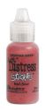
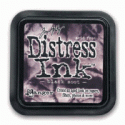
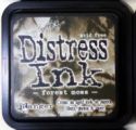
I had no idea when I started where the page was going. I began with white gesso spread in a very thick and textural way across the page using an old gift card. It created lovely hills and valleys which I emphasized with Brushed Corduroy and then Vintage Photo Distress inks. 


Masking tape was applied to old book text paper and then lifted off to remove some of the print. The page was then torn and applied to the background with Matte Medium. White gesso on my finger was scuffed across the text and over the edges to  soften the words and embed the pages into the background.


 Sticking with the natural and more muted neutral colours, I stamped one of the Donna Downey Insightful Meadows flowers several times across the bottom of the page using Coffee Archival ink and including second generation stamping as well. The Stamper's Anonymous Coffee Rings stamp was also inked with the same colour. Returning to Vintage Photo Distress ink, I used a fabulous stencil from Retro Cafe Art to transfer the drippy border along the top edge. The left side of each drip was lined with Sepia Micron pen. White gesso was pounced through punchinella, outlined with Sepia Micron pen and then scuffed again with gesso on my finger so that the sharpness of the outlining was lessened.


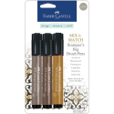
The two butterflies were fussy cut from the Graphic 45's Olde Apothecary Shoppe paper and adhered to the background. Both were outlined loosely and brown half pearls were added to their antennae. The wording came from two different sources in my stash. It amused me to bunch up the letters spelling stretch and wings. It seemed apropos to want to stretch the squished together words. The letters for your were inked around with Vintage Photo before they were adhered to the page. All three words were outlined loosely to add to the sketchy feel of the page. Brown and then black Big Brush pen were used to outline the page on all sides.

This journal page is quite different from my usual vibrantly coloured and funky designs but I thoroughly enjoyed the change and the challenge of using a neutral palette. The sentiment was chosen for this first page because when I leaf through my first completed journal I can really see my style evolving as I have learned to stretch my wings. It's been an exciting and lovely journal so far. Thank you so much for joining me on it.

If you get a chance, pop by the Eclectic Ellapu blog to see what Andria and the rest of the Purples have created for this challenge.  Maybe you'll feel inspired to play along and let the sentiment become the focus of your creation.

Life is good; so is art.
Bonnie

Wednesday, August 28, 2013

Milady Makes a Friend


Last week, I posted Milady, the altered paintbrush, in response to Tracy's eTeam Picks challenge at eclectic Paperie. I mentioned then that I had so much fun with this challenge that I might have to alter another brush. Well, as it happened, we were cleaning the garage on the weekend and I found another brush just begging for some attention. This one is a 2.5" brush volunteering to be Milady's companion.


I started with the fabulous Phrenology stamp from Stampers Anonymous (love it!) which I inked with Coffee Archival and applied to white cardstock. I coloured him with my Prismacolor pencils sticking to the brown tones except for his Parrot Green eyes. Believe it or not, he is totally coloured but the lighter areas are beige with white in the very brightest spots. Once I was satisfied with the shading, I fussy cut him adding black glasses filled with Glossy Accents and three Idea-ology Word Remnant Rubs across his forehead. Walnut Brown Big Brush pen was used around the edges of Spike's head to get rid of the distracting white.


Because Milady has very elegant jewellery, I felt that they must be going out on the town and Spike needed a bow tie. One of the butterflies from Graphic 45's Olde Apothecary Shoppe collection was fussy cut and given  Barn Red Distress Stickles dots plus an Idea-ology pen nib body. Spike's body was stamped with a script stamp using Timber Brown StazOn ink because the brush handle was shiny. An Idea-ology Muse Token saying Unique was adhered to white cardstock smeared with his hair colour paint so that the U would show that colour and the hole behind (which must be his belly button...and, yes,  he is an Innie) was covered.


Because Spike is a thinker, and perhaps a bit Steampunk, I gave him Idea-ology gears spilling out of his head onto his hair. His head is popped up on foam tape so some gears are glued under and some on top for added dimension. And, not to be out done by Milady in the hair department, Spike has two colours of paint, Aquamarine and Blue Green Light, highlighting the top of his do. He might be more conservative than Milady but he is a happenin' guy.


Anyway, as you can see, they make a lovely couple and both are smitten with the other. They'll be great company for each other on my art room wall :) Thanks so much for visiting us today. Do pop over to the eclectic Paperie blog to see the other entries for this eTeam Picks challenge. They'll make you smile, for sure. Come join the fun.

Life is good; so is art.
Bonnie

Some of the goodies I used from the eP store:

 Bonnie

Friday, August 23, 2013

Beach Fun ~ ATCS With Attitude Challenge 47


Wow! Summer is nearly over and soon we'll be enjoying fall. Before that happens, let's celebrate this season with a little more Beach Fun. That's the theme this fortnight at ATCs With Attitude. I chose two wonderful digis from one of our sponsors, Beccy's Place, to feature in beach themed ATCs this week. The first image is called Party Pig and she makes me laugh. She looks like she is having so much fun and I pictured her in a limbo contest at the beach. I coloured Priscilla with Prismacolor pencils and used Glossy Accents to give her beads a little shine. Then she was fussy cut. Would you believe she danced the whole time she was waiting for me to create the background?


Her beach scene started with a scrap of blue checked paper edged with Salty Ocean Distress ink and a scrap of kraft for the sand. The kraft was torn along the top and darkened here and there with Vintage Photo Distress ink. More kraft paper was cut into strips and coloured with Prisma pencils to resemble bamboo (at least in my mind). A toothpick was striped with markers to become the colourful limbo pole. A circle was punched out of a scrap of yellow patterned paper, adhered to the top corner and trimmed to fit. Doodling in black Micron pen made it a more whimsical sun. Black letter stickers were added to the top of the ATC and MuddPuddles Malibu Beach Sand and shells were adhered under and beside Priscilla the Party Pig.


The second ATC features Little Todd from Beccy's Place. Todd seems the opposite of Priscilla. She is exuberant and flashy but Todd is very cool and laid back. Both, however, love the beach. Todd was coloured with Prismacolor pencils. His surfboard was paper pieced and then shaded with Prisma pencil. Todd's shades have Glossy Accents applied to them to create that shiny reflection look. Todd was also fussy cut but there was no dancing while he waited for the background.


The background started with a blue houndstooth patterned scrap overlapped by two rows of wave paper ribbon and torn kraft paper for the sand. The kraft paper was inked with Vintage Photo Distress ink. A sun was punched from the same surfboard paper, adhered to the top left corner, and shaded next to it with a Big Brush pen. Todd was adhered to the background and glittery white stickers were used to spell out Cool. More MuddPuddles sand and shells were adhered to the sand area around Todd. Both ATCs were edged with black Big Brush pen to get rid of the white edges and frame the cards.

Thanks for joining Todd, Priscilla, and me as we enjoy a little Beach Fun today. We always enjoy your good company and lovely comments. If you get a chance, pop over to the ATCs With Attitude blog to see the creative ways my wonderful teammates responded to this challenge. We'd love it if you played along with us, too.

Life is good; so is art.
Bonnie

Thursday, August 22, 2013

My Paintbrush is Dylusional!


Oh my goodness, I had a blast with Tracy's FUNtastic theme for the eclectic Paperie eTeam Picks challenge. Her  challenge is to Get Your Mixed Media On with a Paintbrush as your focal point. The eTeam picks challenge is held on the third Thursday of each month and each challenge is an opportunity for one of the DT to choose the theme and then inspire us with her creation. It's a chance to share your art, have some fun, try something different, and be entered for a prize drawing for a $15 gift certificate to the eclectic Paperie store. I started with a 4" paintbrush from the garage which I never have used because it's too big for my hand to hold comfortably for any length of time. I painted the handle with black gesso and went in search of a face.


The face I chose comes from a Dylusions stamp set called Bits of This. I stamped her on white cardstock using Coffee Archival ink and coloured her funky face with Prismacolor pencils. The circles at the end of her eyelashes were filled in with black half pearls and then her face was fussy cut and matted in black cardstock cut freehand to echo the stamped outline. Since I saw the bristles as her wonderful spiky hair, I tipped the ends with Aquamarine craft paint applied liberally with a 1" brush and allowed to dry.


Next, the lovely lady needed a hairband to cover the silver-coloured metal ferrule of the brush. I chose the harlequin paper from Graphic 45's Olde Curiosity Shoppe collection and the vintage ruler from Graphic 45's An ABC Primer. The ruler was matted on black cardstock first so that a narrow band of black separated the two papers, making each stand out better. All papers were adhered with Scor tape. A twisted length of turquoise dyed crinkled seam binding was hot glued between the bottom of the ruler and the top of her head to pull the turquoise colour down the brush. The harlequin paper was also fussy cut to create the black diamonds along the top edge. Three mulberry flowers were adhered to her headband.


Now, Milady needed a necklace to grace her slender neck. Again, I wanted to bring the turquoise colour through the brush top to bottom so I chose a domed butterfly sticker for the center and Glossy Accented turquoise gems on both sides to form the necklace. We tried out earrings but both Milady and I agreed that it was too much. Less is sometimes more :) We did finish the very bottom of the brush handle with one of the triangles that was cut off of her harlequin headband. It was inked on all sides with Black Soot Distress ink and glued below the hole in the handle. Oh my word, she makes me smile.

Be sure to pop over to the eclectic Paperie blog to check out the wonderfully creative and talented Tracy's awesome altered paintbrush. Oh. that hair! If you click on the thumbnails below her post that are marked DT, you can see how the rest of the team responds. I'm really hoping you will be inspired to join us. I can't wait to see what you create. I'm thinking I might have to make another one.

Thanks for visiting today.That makes me smile, too.

Life is good; so is art.
Bonnie

Here is a set of links to the eclectic Paperie store for some of the products I used on this brush:

Monday, August 19, 2013

Bonnie Girl~ CYP challenge 176


Have I ever mentioned how much I enjoy colouring faces? I might have a time or two...lol. I love watching their expressions appear and to see them come alive beneath my pencils. Sometimes the width of a pencil lead will change the expression completely and I always feel that they are emerging rather than that I am creating them. Such was the case for today's card for the Craft Your Passion Challenges theme of Floral Delights. The adorable little girl, who is called Bonnie Girl 1 (and I didn't name her either) comes from Digital Paper Crafts. I coloured her face, hair, and limbs with Prismacolor pencils which I also used to shade her paper pieced dress and headband. I wanted floral paper for her dress and used the stem/leaf pattern for her headband.

The background papers as well as her dress paper come from MME's Reunion paper pad. Dark brown textured cardstock was used to mat the floral and dotted rectangles to provide contrast and greater definition. The border is actually cut with a Cheery Lynn Designs rolled flower die which I didn't roll. I thought the petal shapes were interesting and suited the floral theme.


Because Bonnie Girl was sitting, she needed a perch of some sort. Two layers of silk flower were placed over a small doily and held together with a brad. Bonnie was then able to sit in the center of the flower. The stem was hand cut and the leaves punched. Both were matted in brown so they would be more visible. A tiny butterfly button was threaded with brown embroidery floss. The ends were left showing to form the antennae which were tipped with brown flat pearls. A trail was doodled with a brown Zig pen. The sentiment was done with a Fancy Pants stamp on a Spellbinders die cut label. Faux stitching and Vintage Photo Distress ink decorated the matted edges. The sentiment was popped up on foam dots and flower brads with brown pearls added to the centers filled in the holes on the ends of the label.

So let's see... I have floral background paper, a floral dress, flower brads, a layered flower...I guess that pretty much addresses the Craft Your Passion Challenges theme of Floral Delights. I hope you get a minute to stop by the Craft Your Passion blog to see the wonderful projects by the rest of the DT. They have done an awesome job...AGAIN. Thanks for visiting today. I  appreciate and enjoy your visits and comments. They make my day.

I am entering this card in the following challenges:
613 Avenue Create #33 ~ Anything Goes/use real or faux stitching
Challenges 4 Everybody #27 ~ Anything Goes
Allsorts #220 ~ Use Your New Stash (button, digi, sentiment stamp)
Sugar Creek Hollow #67 ~ A Child's Life
My Creative Moments August Wordplay Saturday ~ Childhood

Life is good; so is art.
Bonnie

Sunday, August 18, 2013

Any old excuse ~ Eclectic Ellapu challenge


Jacki's challenge this week for the Purple Team at Eclectic Ellapu is to use playing cards in your project so, of course, I seized the opportunity to complete a few more altered playing cards for my collection. The backgrounds are done the same way as the rest with a mix of Neocolor II crayons, Inktense blocks, stencilling, stamping, gelatos,  torn paper scraps, and Stampers' Big Brush pens. Anything that will add colour is fair game on these. The images come from various collage sheets mainly from Tumble Fish Studio at Deviant Scrap. For the card above, I used a scrap of an old map behind the image of the young man which I placed in the thimble. I saw the thimble as the basket of a hot air balloon so I added twine to reflect that. The computer generated sentiment also gives a nod to his travels and the background reminds me of the ground viewed from the sky.


The second card is a mix of three images (cup, head, body) with a hand-cut hat added for fun. She looks so serious that the contrast of the silly hat and her expression makes me laugh. I think she is floating down a river, although from what or to what I'll leave to your imagination.


The third card in this series started with a frisket covered circle before the colour was applied to the playing card. This left that part uncoloured once the frisket was rubbed off. The images of the man, moon, and hat are all from different collage collections. The musical notes and the ruler are both washi tape. The moon's crown has flat black pearls on the points All cards are edged with black Big Brush pen and a few have some Distress ink used on the edges as well. They are very random in construction and often not done all in one sitting which makes them great fun to watch as they evolve.

Thanks for joining me again today. I hope you aren't tired of these yet. I know I'm not. If you get a chance, do pop over to the Eclectic Ellapu blog to see the inspirational creations from the rest of the Purple Team. They are a creative bunch. As for me, I am on round 2 of antibiotics. Hopefully, this time will do the trick. It's putting me behind on important things like visiting your blogs :)

Life is good; so is art.
Bonnie

Thursday, August 15, 2013

She Dreamed ~ art journal


It's been a while since I played in my art journal so I listened when it called me even though I didn't have a single idea as a jump off point. I started out with a gessoed double page spread to which I applied embossing paste through the Dylusions Diamond of a Border stencil.


Once that was dry I applied yellow-green, yellow ochre, and two shades of blue Pan Pastels randomly over the embossed background, blending where they met. Still no ideas....hmmm. The journal was sprayed with a fixative because I wasn't sure where I was going next.


I tore two solids from Authentique's Strong paper pad and glued them to the pages  along with a layer of torn canvas. Ranger Archival Coffee ink was used to stamp Unity's Cooped Up Notes on both the paper and the background. Inktense pencils were used to shade next to the overlapping papers and spread with a waterbrush. Forest Moss Distress ink was used to tone down the yellowish green Pan Pastel in order to make it suit the papers and images to come. It also helped to grunge up the background which was the look I was wanting although I still didn't know why. Brown Big Brush pen was used to edge the pages, making sure that it overlapped the front periodically.


The two large images plus the hat come from Tumblefish Studio's collage sheets...love 'em! I started with the woman, Sylvia, who looked wistful and a bit sad to me. She seemed to have a story to tell. She didn't seem to be having fun so I decided to help her out with a silly hat and whimsical friend.


That led me to create the message which I then computer generated and matted in black. The typewriter keys images were purchased on Etsy (I think) and were fussy cut and given a good coat of Glossy Accents for shine and dimension. The images were fussy cut, lined with black Big Brush pen, and adhered to the pages.


A length of lace trim was tucked under Sylvia's elbow to lend a vintage and perhaps formal touch. I think she isn't allowed to be silly very often. The piece cut off of the trim was adhered below it. A stray length of black border cut with an MFT die (and yes, it was sitting on my desk) was cut into two pieces and adhered to each page.


Both slightly watered black gesso and white gesso were used to make the rings scattered around the pages.


A hand charm was adhered with Glossy Accents so that it's pointing to the beginning of the sentiment and emphasizing the word SHE. Lots of doodling with a Chocolate brown Zig Writer, some green stamping with a star from Autumn Leaves, and my favourite TH splatter stamp in Coffee Archival ink completed the pages.


Thanks for visiting today and helping me show Sylvia that she needs a little fun in her life every day. And really, don't we all! I'm hoping that she will find a way to infuse a little into her life regardless of the expectations placed upon her by others, by herself, and by her own responsibilities. I hope you have a little fun ...or a lot...today, too.

Life is good; so is art.
Bonnie

Some of the products I used on this project can be found at eclectic Paperie. Just click on the thumbnails below: